
Client
Halden Coffee Roasters
Year
2026
Role
Lead designer
Deliverables
Identity, packaging, website
The brief
Halden had outgrown the hand-drawn logo they launched with in a garage. They wanted an identity that could stretch from a 250 g bag to a café wall, without losing the warmth regulars loved.

The approach
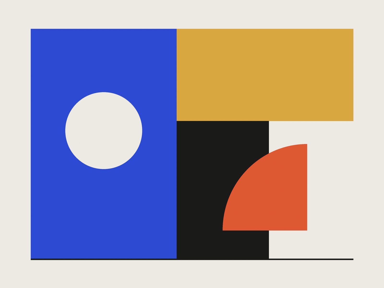
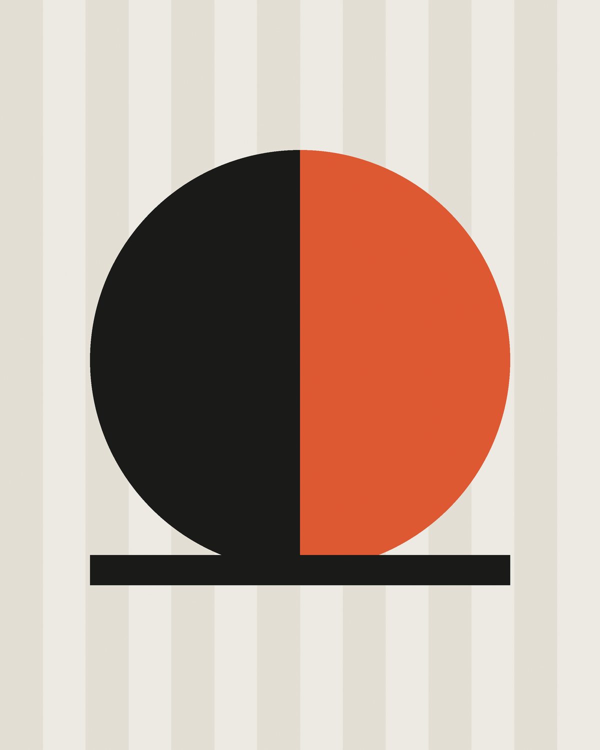
We built the system around a single shape, the arc of a cup seen from above, and let it repeat, crop and scale. A two-colour palette keeps print costs low while the arc gives every touchpoint a family resemblance.
One shape, used with discipline, did more work than ten clever ideas.

Results
+64%
online orders in the first quarter
3×
newsletter sign-ups after launch
11
new wholesale partners